LinearGradient in SwiftUI, Light and Dark theme
- add-custom-library-swiftui
- custom-buttons-in-swiftui
- custom-color-in-swiftui
- custom-list-in-swiftui
- custom-textfield-in-swiftui
- detect-os-in-swiftui
- detect-the-current-theme-in-swiftui
- lazyvgrid-and-lazyhgrid-in-swiftui-part-1
- lazyvgrid-and-lazyhgrid-in-swiftui-part-2-3
- lineargradient-swiftui
- the-happy-programmer
Color Gradient has become very common lately. It has been applied to logos and it looks extremely eye candy. In this post, you will be shown how to apply it in LinearGradient in SwiftUI for both Light and Dark theme
Add Asset color
The first step we need to take is to make two Asset colors. Borth for light and dark theme, we could have used the colorScheme to detect whether is .light or .dark theme and by using if statements to make the system respond accordingly. This time we will achieve the same result in a neater way, by adding Asset colours, that way we will avoid many lines of code.
By going to assets we can add the wanted colors, feel free to choose your own combination. I will be choosing Dark Green and Teal because they blend together beautifully.
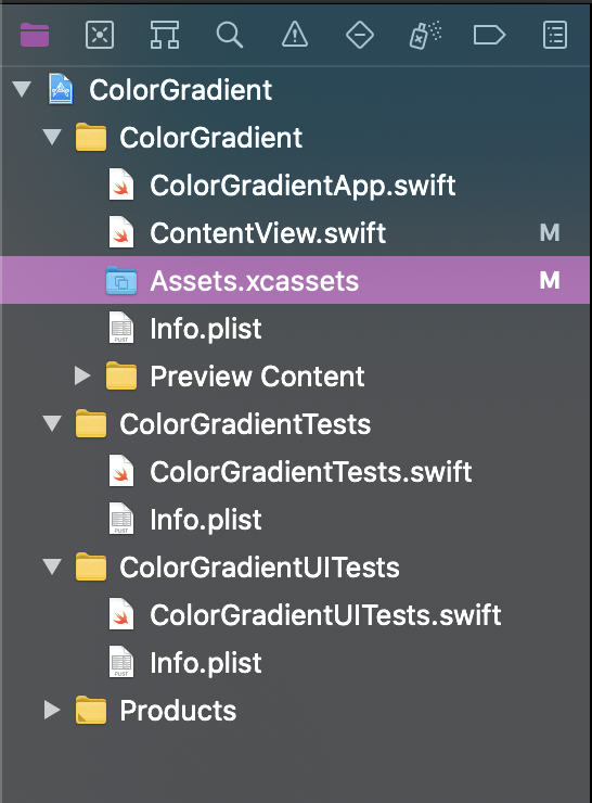
Add Colors on Assets file
Try to pick light colours for the light theme and dark for the dark theme. SwifUI allows us to set colors which will change according to the theme we are currently in.
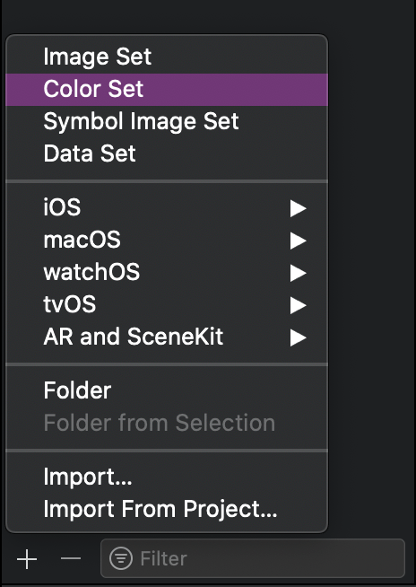
Add a Color, you will find at the bottom
This is my suggested combination
The bellow combination is a purple in light mode and a teal in dark mode. As you can see, Xcode gives your the opportunity to choose 8-bit RGB. The choice is yours. The LinearGradient will work with any color combination, but bear in mind it has to fulfil aesthetics requirements.
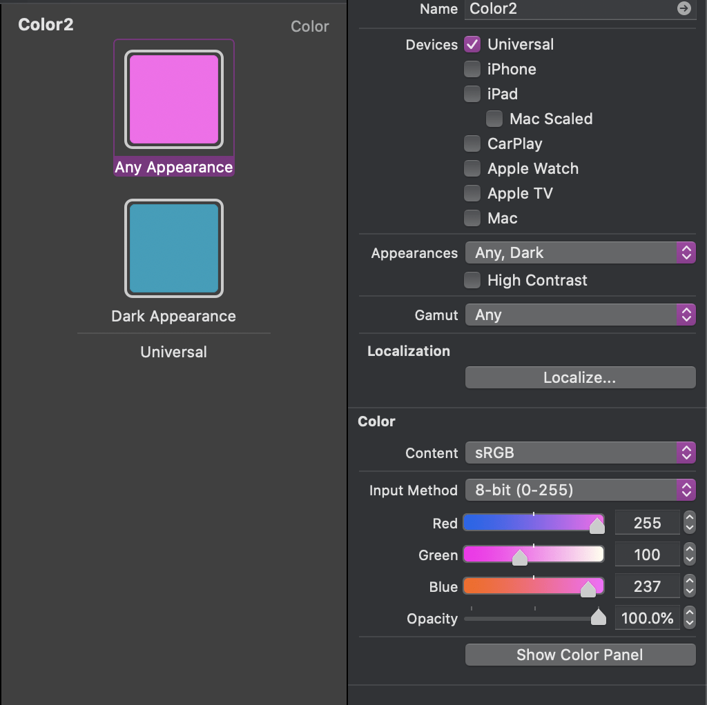
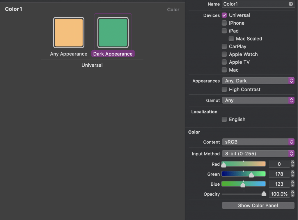
This is the dark mode teal color.
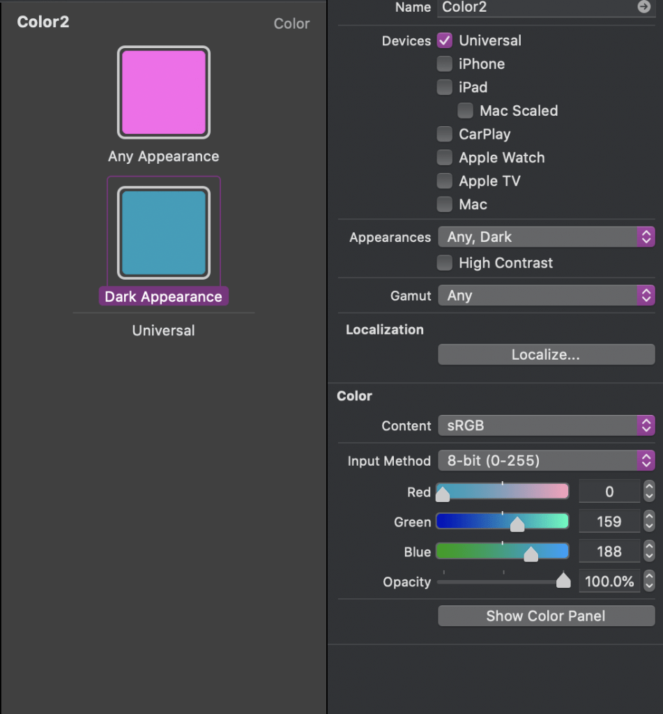
Do the same with another combination of colors.
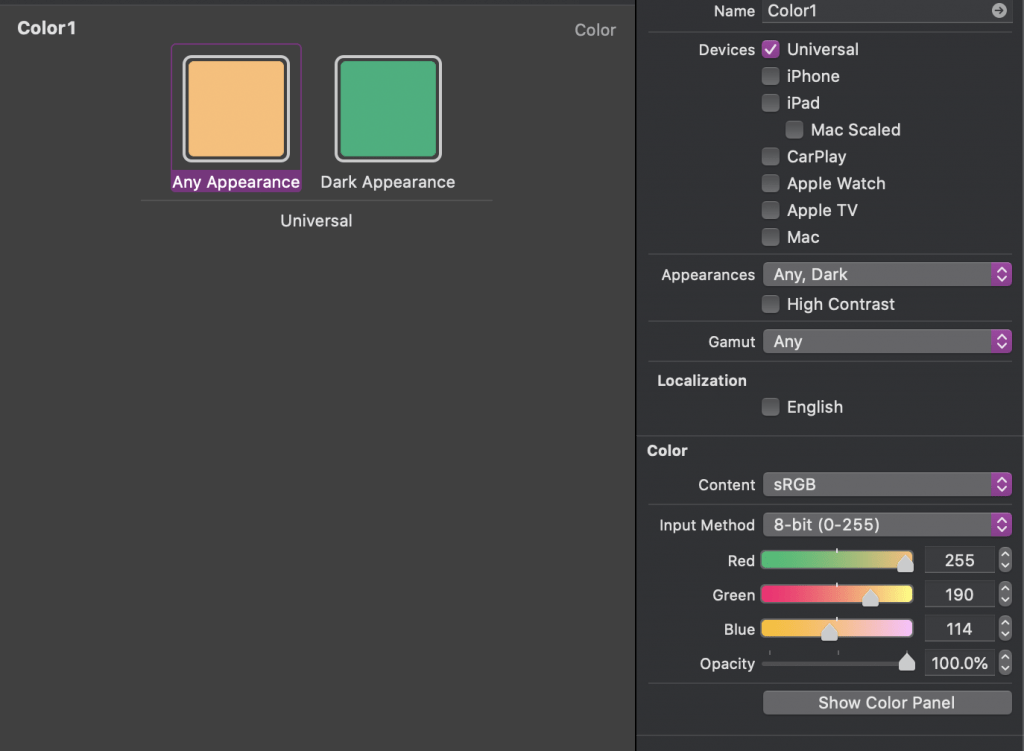
This is my Color1
The orange
The Green
Create data to iterate
in order to avoid repeating the same code, I decided to create mock data.
struct Card: Identifiable {
    let id = UUID()
    let name: String
    let photo: String
    let title: String
    let subTitle: String
}
let cards = [
    Card(name: "Nicky Dolores", photo: "user", title: "Make up Artist", subTitle: "Hourly - 24$"),
    Card(name: "Elie Smith", photo: "user1", title: "Model", subTitle: "Hourly - 400$"),
    Card(name: "Debby Doe", photo: "user2", title: "Influencer", subTitle: "Hourly - 2,004$")
]
Usage of LinearGradient
struct ContentView: View {
    var body: some View {
        NavigationView {
            ScrollView(showsIndicators: false) {
                ForEach(cards) { c in
                    VStack(alignment: .trailing ) {
                        HStack(alignment: .top){
                            VStack(alignment: .leading) {
                                Text(c.title)
                                    .font(.title)
                                    .bold()
                                Text(c.subTitle)
                                    .font(.subheadline)
                                    .foregroundColor(Color.secondary)
                            }.padding(.horizontal, 0)
                            Spacer()
                        }.padding()
                        Spacer()
                        HStack {
                            HStack {
                                Text(c.name)
                                    .font(.caption)
                                    .fontWeight(.black)
                                    .foregroundColor(Color.secondary)

                                    Spacer()
                                Image(c.photo)
                                    .resizable()
                                    .frame(width: 40, height: 40, alignment: .center)
                                    .clipShape(Circle())
                                    .shadow(radius: 5)
                            }.padding()

                        }.background(Color.black.opacity(0.2))
                    }

                    .frame(width: 370, height: 280)
                    .background(LinearGradient(gradient: Gradient(colors: [Color("Color1"), Color("Color2")]), startPoint: .top, endPoint: .bottomTrailing))
                    .cornerRadius(20)
                    .shadow(radius: 12)
                    .padding(.bottom, 20)
                }
                .padding(35)
            } .padding(-20)
            .navigationTitle("Professionals")
        }
    }
}
There are a lot of things to explain, but I will focus on the lesson for this post.
.background(LinearGradient(gradient: Gradient(colors: [Color("Color1"), Color("Color2")]), startPoint: .top, endPoint: .bottomTrailing))
The colors we created are Color("Color1") and Color("Color2"). Which they have representatives in both light and dark appearance.
The startPoint: .top, is the starting point for the color and there are many options which represent when the first color will start. Same with endPoint: .bottomTrailing which is where it will start the transition of the color.
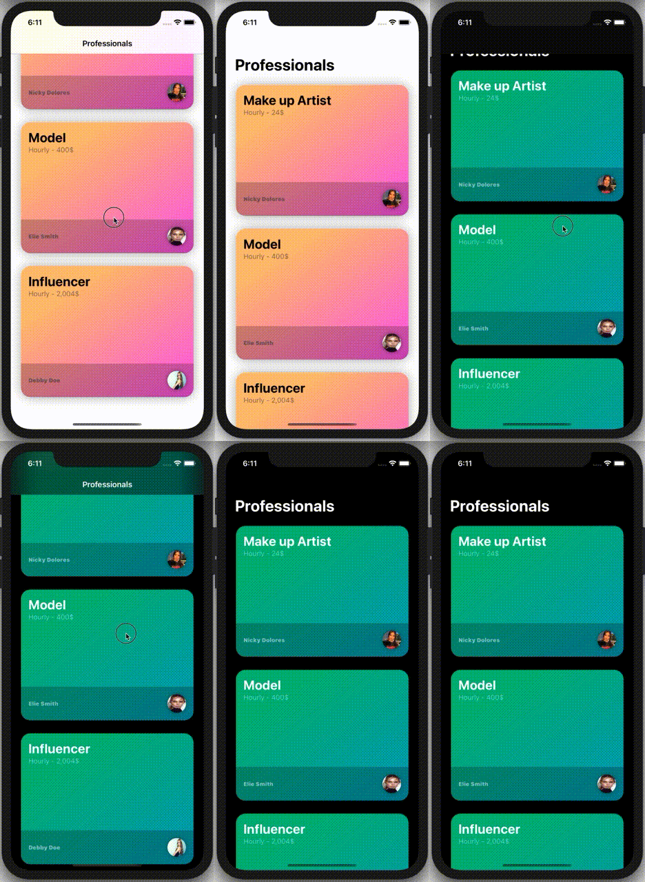
The complete review
You can find the code on GitHub.
Pages
Home
Courses
Blog
About
Tags
Swift
SwiftUI
Announcements
NuxtJS
Categories
Announcements
SwiftUI
Follow us
subscribe to our newsletter
Copyright © 2023 Inc. All rights reserved.