LazyVGrid and LazyHGrid in SwiftUI (Part 2/3)
- add-custom-library-swiftui
- custom-buttons-in-swiftui
- custom-color-in-swiftui
- custom-list-in-swiftui
- custom-textfield-in-swiftui
- detect-os-in-swiftui
- detect-the-current-theme-in-swiftui
- lazyvgrid-and-lazyhgrid-in-swiftui-part-1
- lazyvgrid-and-lazyhgrid-in-swiftui-part-2-3
- lineargradient-swiftui
- the-happy-programmer
On the previews post of this series I focused on LazyVGrid. In this post I will be focusing on LazyHGrid in SwiftUI. If you have not read the previous first part of these series I highly suggest you go and take a look as this post is the continuation of LazyVGrid and LazyHGrid in SwiftUI (Part 1/3).
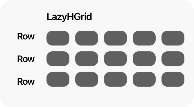
Explanation of LazyHGrid in SwiftUI
LazyHGrid is a view which allows you to display large amount of data being loaded at the time the user. Therefore the Lazy on the View's title. The data is being loaded only when it is required, The rows are adjustable. The H on title means that they are going to be stuck in a horizontal way
LazyHGrid(rows: [GridItem(.fixed(20))], alignment: .center, spacing: nil, pinnedViews: [], content: {
                Text("Placeholder")
                Text("Placeholder")
            })
The above code is very straightforward on the rows: you can add the rows, I have explained row's (GridItem) attributes on a previous post LazyVGrid and LazyHGrid in SwiftUI (Part 1/3). The alignment takes .bottom, .center, .top, .firstTextBaseline, .lastTextBaseline. They all represent the position of the grid based on it's frame. Therefore, adding more rows means more rows in your Grid.
LazyHGrid explained
Create with LazyHGrid in SwiftUI
I will be keeping the code from the previous part, and crate a LazyHGrid reusable structure to place it on the top of the view, in addition I will give the user the option to add and reverse the grid from one or two rows.
First off, you need to create the view which it will store the reusable LazyHGrid
struct HViewGrid: View {
    var title: String
    @State var seeMore = false
    let rows = [
        GridItem(.flexible()),GridItem(.flexible())
    ]

    let row = [
        GridItem(.flexible())
    ]

    var body: some View {
        VStack {
            HStack {
                Text(title).bold()
                Spacer()
                Button(action: {
                    withAnimation {
                        self.seeMore.toggle()
                    }
                }, label: {
                    Image(systemName: "chevron.right")
                            .rotationEffect(.degrees(seeMore ? 90 : 0))
                        .foregroundColor(.black)
                })
            }.padding(.horizontal)
            ScrollView(.horizontal, showsIndicators: false) {
                LazyHGrid(rows: seeMore ? rows : row, alignment: .firstTextBaseline) {
                        ForEach(cocktails) { m in
                            doubleColumn(m: m).frame(width: 150)
                        }
                    }.padding(.leading).frame(height: seeMore ? 410 : 200)
            }.ignoresSafeArea(edges: .vertical)
            Divider().padding(.all)
        }
    }
}
As you can see I have added a condition to check through a state whether the users decides to have one row or two. Furthermore I have added an animation when the seeMore button is pressed will give the animation like the grid expands.
Apply everything together
From the previous post of this series, I have changed the design of the top bar.
The next and last step is to combine everything together.
struct ContentView: View {

    let columns = [
        GridItem(.flexible()),GridItem(.flexible())
    ]

    let column = [GridItem(.flexible())]
    @State var search = false
    @State var searchText = ""
    @State var gridOption = false
    var body: some View {
                ScrollView {
                        HStack {
                            Button(action: {
                                withAnimation {search.toggle()}
                            }) {
                                HStack {
                                    Image(systemName: "magnifyingglass").foregroundColor(.black).font(.title2)
                                }
                            }
                            Spacer(minLength: 0)
                            Image("logoDark")
                                .resizable()
                                .frame(width: 90, height: 25)
                                .aspectRatio(contentMode: .fit)

                            Spacer(minLength: 0)
                            Button(action: {
                                withAnimation {
                                    gridOption.toggle()
                                }
                            }) {
                                Image(systemName: gridOption ? "rectangle.grid.1x2.fill" : "square.grid.2x2.fill").foregroundColor(.black).font(.title2)
                            }
                        }.padding()
                    HStack {
                        VStack(alignment: .leading) {
                            Text("Cocktails").font(.title).bold()
                            Divider()
                        }


                        Spacer()

                    }.padding(.horizontal)
                    if gridOption {HViewGrid(title: "Your Favourites")}

                    LazyVGrid(columns: gridOption ? columns : column , alignment: .center) {
                        ForEach(cocktails) { m in
                            if gridOption {
                                doubleColumn(m: m)
                            } else {
                                singleColumn(m: m)
                            }
                        }
                    }.padding(.horizontal)
                }.navigationTitle("Cocktails")
            .navigationBarItems(leading: EditButton())
    }
}
The code above contains code from the first post. The only thing I have added is the line bellow
if gridOption {HViewGrid(title: "Your Favourites")}
The above line shows the HViewGrid on the double column view.
Result
https://videopress.com/v/HNMQCcu1?resizeToParent=true&cover=true&autoPlay=true&loop=true&preloadContent=metadata
LazyVGrid and LazyHGrid in SwiftUI (Part 2/3) the result
You can find the code on my github
On the third part of these series I will be adding the ability for the grid item to expand according to the size of the image. stay tuned.
Pages
Home
Courses
Blog
About
Tags
Swift
SwiftUI
Announcements
NuxtJS
Categories
Announcements
SwiftUI
Follow us
subscribe to our newsletter
Copyright © 2023 Inc. All rights reserved.