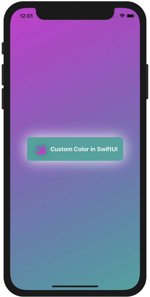
Custom Color in SwiftUI.
- add-custom-library-swiftui
- custom-buttons-in-swiftui
- custom-color-in-swiftui
- custom-list-in-swiftui
- custom-textfield-in-swiftui
- detect-os-in-swiftui
- detect-the-current-theme-in-swiftui
- lazyvgrid-and-lazyhgrid-in-swiftui-part-1
- lazyvgrid-and-lazyhgrid-in-swiftui-part-2-3
- lineargradient-swiftui
- the-happy-programmer
In this post I will cover how you can create your own custom color in SwiftUI. SwiftUI comes with default colors out of the box. We will create an example using the made custom colors to decorate the text and the System Image I am going to implement. I will also use LinearGradient() to make an appealing background starting from .topLeading and ending to .bottomTrailing.
Create the custom colors.
extension Color {
    static let teal = Color(red: 49 / 255, green: 163 / 255, blue: 159 / 255)
    static let darkPink = Color(red: 208 / 255, green: 45 / 255, blue: 208 / 255)
}
firstly, I will start with a simple extension we can create a custom color. In this case is an RPG that is why is divided 255. You can use that color through out the app. if you want to go a step further, see how you can add a modifier or even a View in a library. Checkout my other post here Add a Custom Library SwiftUI. The above Color extensions can be given any name and they are accessible from the array of colors. Therefore, we can access the already created custom colors through the array of the default (build in) colors. for instance, in this case it will be Color.teal and Color.darkPink. but this is not the only way to make a custom color and on the link above you can find the other.
Apply the custom color.
struct ContentView: View {
    var body: some View {
        ZStack {
            LinearGradient(gradient: Gradient(colors: [Color.darkPink, Color.teal]), startPoint: .topLeading, endPoint: .bottomTrailing)
            HStack {
                Image(systemName: "swift")
                    .foregroundColor(Color.darkPink)
                    .font(.system(size: 35))
                    .shadow(radius: 10)
                Text("Custom Color in SwiftUI")
                    .foregroundColor(Color.white)
                    .fontWeight(.bold)
            }
            .padding()
            .background(Color.teal)
            .cornerRadius(10)
            .shadow(color: Color.white, radius: 20)
        }.ignoresSafeArea()
    }
}

custom color in SwiftUI used all over the example.
Secondly, The above piece of code combines everything together by giving a LinearGradient() background A simple padding() around the text so it will make it look like an announcement. I have used the custom color for the text background and to decorate the swift system image. I have added a white shadow so it will pop out, giving that illusion of a backlight text tag.
Here you can find another way how to make a custom color, this time it will change according to dark/light mode.
Find the code on my GitHub.
Pages
Home
Courses
Blog
About
Tags
Swift
SwiftUI
Announcements
NuxtJS
Categories
Announcements
SwiftUI
Follow us
subscribe to our newsletter
Copyright © 2023 Inc. All rights reserved.