On this post I will cover how you can create your own reusable custom TextField in SwiftUI and iOS 14. Further more I will be explaining how you can make these textfields styles reusable. each TextField is going to be having a different way to be made reusable.
https://videopress.com/v/XX0Jlr0c?resizeToParent=true&cover=true&autoPlay=true&loop=true&preloadContent=metadata
Overview Custom TextField in SwiftUI By TheHappyProgrammer.com
Firstly, I will start with the understanding of the textFieldStyle() modifier. textFieldStyle() takes an argument with TextFieldStyle protocol. SwiftUI comes with a couple of default styles. Such as DefaultTextFieldStyle(), PlainTextFieldStyle(), RoundedBorderTextFieldStyle(). The DefaultTextFieldStyle() modifier is mostly being used to build up a design as it is being suggested by Apple to do so. While Default and Plain they look the same, RoundedBoarderTextFieldStyle() has rounded corners and pre set background.
Built in TextField styles
DefaultTextFieldStyle()PlainTextFieldStyle()RoundedBorderTextFieldStyle()
Default TextField style
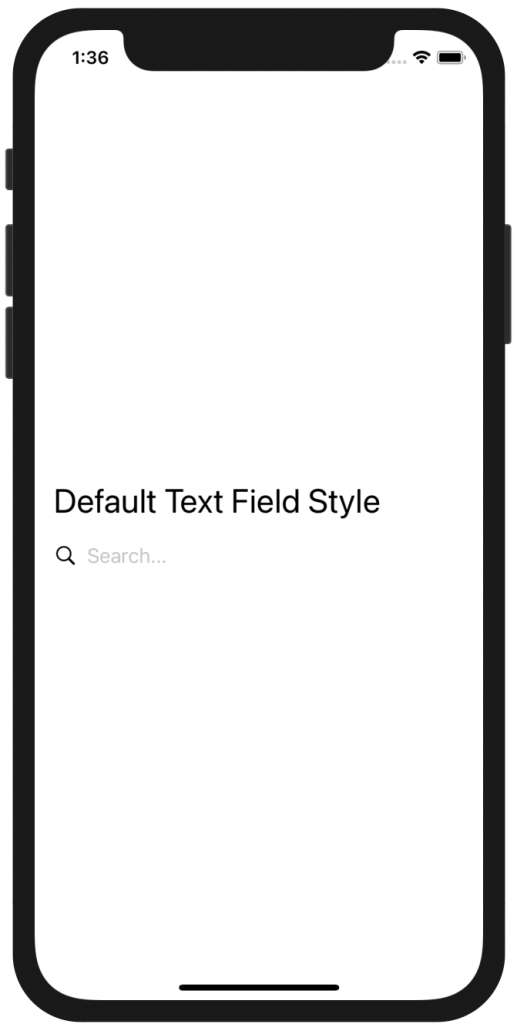
DefaultTextFieldStyle()
struct ContentView: View {
    @State var text = ""
var body: some View {
VStack(alignment: .leading) {
                Text("Default Text Field Style").font(.title)
                HStack {
                    Image(systemName: "magnifyingglass")
                    TextField("Search...", text: $text)
                }
                .textFieldStyle(DefaultTextFieldStyle())
            }.padding()
   }
}
In SwiftUI if you add a system Image and TextField in a HStack it aligns them to make it look like the image is the representative of the TextField.
Rounded corners TextField
same with the previous example. I applied a style in the .textFieldStyle()
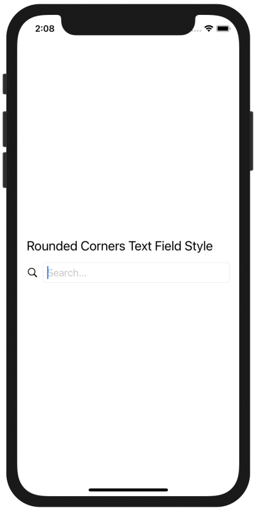
Rounded Corners TextField
struct ContentView: View {
    @State var text = ""
var body: some View {
VStack(alignment: .leading) {
                Text("Rounded Corners Text Field Style").font(.title2)
                HStack {
                    Image(systemName: "magnifyingglass")
                    TextField("Search...", text: $text)
                }
                .textFieldStyle(RoundedBorderTextFieldStyle())
            }.padding()
    }
}
Custom TextField Oval
As I promised on the introduction I will not only give different TextField designs but I will be giving different ways to make them reusable. As I have explained above TextFieldStyle is a modifier which means we can configure a new TextField style in the view hierarchy. I will achieve this by passing in a struct the TextFieldStyle protocol. The code will look like this.
struct OvalTextFieldStyle: TextFieldStyle {
    func _body(configuration: TextField<Self._Label>) -> some View {
        configuration
            .padding(10)
            .background(LinearGradient(gradient: Gradient(colors: [Color.orange, Color.orange]), startPoint: .topLeading, endPoint: .bottomTrailing))
            .cornerRadius(20)
            .shadow(color: .gray, radius: 10)
    }
}
you can add arguments if you want to make It even more adjustable. I have added a LinearGradient, and give same colors. You can play with it.
This is how we can use the custom TextField in SwiftUI
struct ContentView: View {
    @State var text = ""
var body: some View {
VStack(alignment: .leading) {
                Text("Oval Custom TextField Style").font(.title2)
                HStack {
                    TextField("Search...", text: $text)
                }
                .textFieldStyle(OvalTextFieldStyle())
            }.padding()
}
}
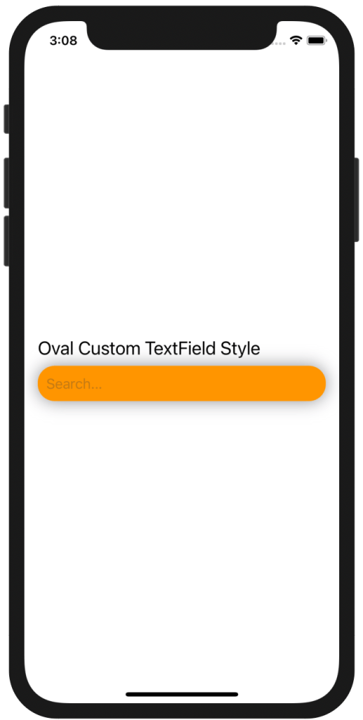
Oval Custom TextField in SwiftUI
Outlined custom TextField
In this custom design, I will be making a custom view modifier which is the same philosophy we did above but this time this is a view modifier passed in the ViewModifier protocol.
struct customViewModifier: ViewModifier {
    var roundedCornes: CGFloat
    var startColor: Color
    var endColor: Color
    var textColor: Color

    func body(content: Content) -> some View {
        content
            .padding()
            .background(LinearGradient(gradient: Gradient(colors: [startColor, endColor]), startPoint: .topLeading, endPoint: .bottomTrailing))
            .cornerRadius(roundedCornes)
            .padding(3)
            .foregroundColor(textColor)
            .overlay(RoundedRectangle(cornerRadius: roundedCornes)
                        .stroke(LinearGradient(gradient: Gradient(colors: [startColor, endColor]), startPoint: .topLeading, endPoint: .bottomTrailing), lineWidth: 2.5))
            .font(.custom("Open Sans", size: 18))

            .shadow(radius: 10)
    }
}
As you can see the abode code is very straight forward, bear in mind this modifier can be applied in any View and it is not strictly applied to a TextField. To use this reusable modifier we need to wrap it in a modifier View. This is how we can use it .modifier(customViewModifier(:arguments:)) of course feel free to play with the cornerRadius there.
struct ContentView: View {
    @State var text = ""
var body: some View {
VStack(alignment: .leading) {
                Text("Outlined Custom TextField Style").font(.title2)
                HStack {
                    Image(systemName: "magnifyingglass")
                    TextField("Search...", text: $text)
                }.modifier(customViewModifier(roundedCornes: 6, startColor: .orange, endColor: .purple, textColor: .white))
            }.padding()
    }
}
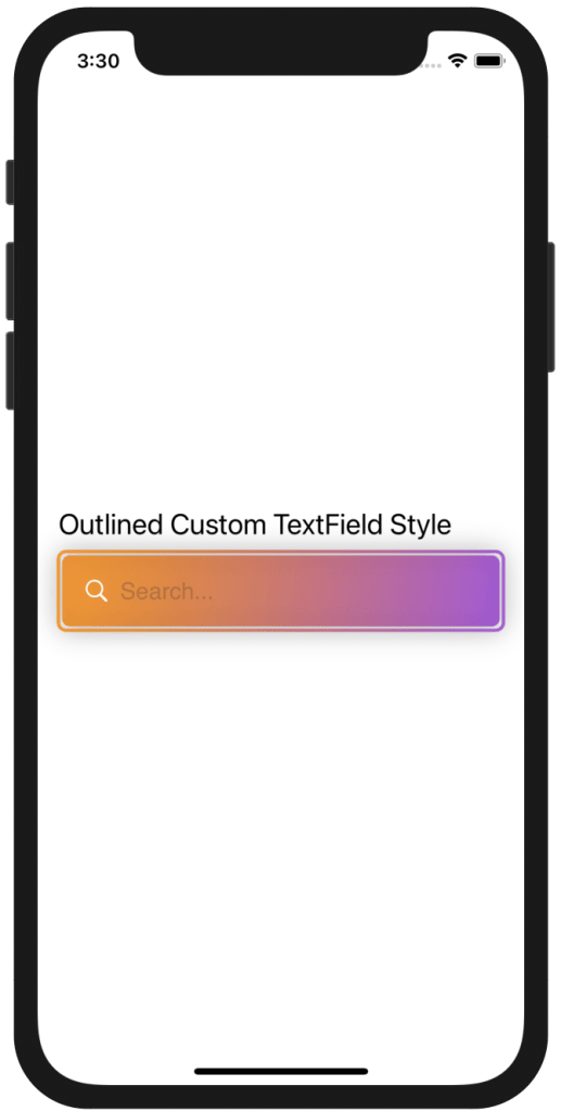
Outlined TextField
Illusion custom TextField.
The next example is what a I call an illusion TextField, I call it that way because it gives you the feeling that it gets narrower along the way. What is really? a LinearGradient with a shadow with have the same color with the ending color. This time the way to make it reusable is to extend the TextField View, the same you would do to add a modifier to an Image or to create your own custom color. This is how it will look. Note, that this extension can only be applied to a TextField as it is a modifier for that specific view.
extension TextField {

    func extensionTextFieldView(roundedCornes: CGFloat, startColor: Color,  endColor: Color) -> some View {
        self
            .padding()
            .background(LinearGradient(gradient: Gradient(colors: [startColor, endColor]), startPoint: .topLeading, endPoint: .bottomTrailing))
            .cornerRadius(roundedCornes)
            .shadow(color: .purple, radius: 10)
    }
}
This is how you can apply it
struct ContentView: View {
    @State var text = ""
var body: some View {
VStack(alignment: .leading) {
                Text("Illusion Custom TextField Style").font(.title2)
                HStack {
                    TextField("Search...", text: $text).extensionTextFieldView(roundedCornes: 6, startColor: .white, endColor: .purple)
                }
            }.padding()
}
}
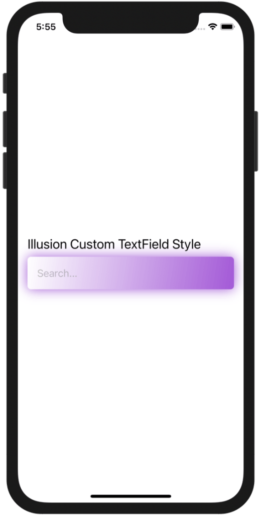
Illusion TextField
Neumorphic style TextField
As I promised at the very beginning I will be trying to cover most of the design languages I can cover in a post. Neumophism could not be left out. But in order to be able to make it look in like neumorphic design we have to create our own colors. As I did in one of my previous post, Custom Color in SwiftUI , I will create three custom colors.
extension Color {
    static let lightShadow = Color(red: 255 / 255, green: 255 / 255, blue: 255 / 255)
    static let darkShadow = Color(red: 163 / 255, green: 177 / 255, blue: 198 / 255)
    static let background = Color(red: 224 / 255, green: 229 / 255, blue: 236 / 255)
    static let neumorphictextColor = Color(red: 132 / 255, green: 132 / 255, blue: 132 / 255)
}
You all know what makes it neumorphic, is the different layers of shadows. Apparently the off white background. The way we will make it reusable this time, is by passing in as an argument to a struct the TextField itself, so when we are going to reuse it we only have to pass the TextField, the colors that go with it and of course the sf Image.
struct NeumorphicStyleTextField: View {
    var textField: TextField<Text>
    var imageName: String
    var body: some View {
        HStack {
            Image(systemName: imageName)
                .foregroundColor(.darkShadow)
            textField
            }
            .padding()
            .foregroundColor(.neumorphictextColor)
            .background(Color.background)
            .cornerRadius(6)
            .shadow(color: Color.darkShadow, radius: 3, x: 2, y: 2)
            .shadow(color: Color.lightShadow, radius: 3, x: -2, y: -2)

        }
}
Usage
This is how we can use it, using the custom colors we created I changed the background to Color.background.
struct ContentView: View {
    @State var text = ""
    var body: some View {
        ZStack {
            Color.background.ignoresSafeArea()
            VStack(alignment: .leading) {
                Text("Illusion Custom TextField Style").font(.title2).foregroundColor(.neumorphictextColor)
                HStack {
                    NeumorphicStyleTextField(textField: TextField("Search...", text: $text), imageName: "magnifyingglass")
                }
            }.padding()
        }
    }
}
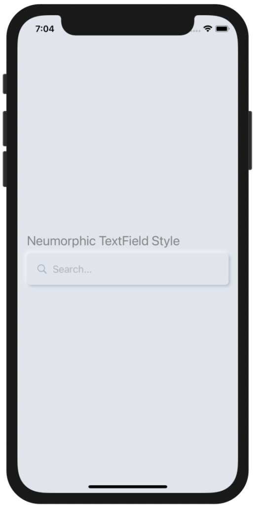
Neumorphic TextField
Underlined style TextField
The next example of Custom TextField style, is an underlined TextField. I have connected the sf image color with the underline color. I have made a custom color too to make it look even better. The way this TextField style is being reusable is by extending a View.
extension Color {
    static let darkPink = Color(red: 208 / 255, green: 45 / 255, blue: 208 / 255)
}
extension View {
    func underlineTextField() -> some View {
        self
            .padding(.vertical, 10)
            .overlay(Rectangle().frame(height: 2).padding(.top, 35))
            .foregroundColor(.darkPink)
            .padding(10)
    }
}
This is how you can use it.
struct ContentView: View {

    @State var text = ""
    var body: some View {
        ZStack {
            Color.white.ignoresSafeArea()
            VStack(alignment: .leading) {
                Text("Underlined TextField Style").font(.title2)
                HStack {
                    Image(systemName: "magnifyingglass")
                    TextField("Search", text: $text)
                }.underlineTextField()
            }.padding()
        }
    }
}
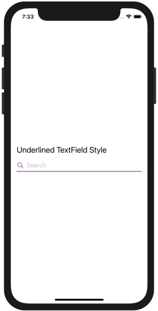
Underlined TextField