

Lists are very important in SwiftUI development. In this post, I will be trying to show you how you can make a custom list in SwiftUI. The purpose of this post is to teach you how you can make your own lists, without having to rely on the pre-made lists from Apple. I will be showing you how to make your own custom NavigationBar.
Default List Styles in SwiftUI
First I will create a list by using the default options you have out of the box with SwiftUI 2.0. I have created a row, in a NavigationView. where a NavigationLink leads to a simple View. The options you have are the following, where you can apply them to a listStyle() modifier.
DefaultListStyle()GroupedListStyle()InsetGroupedListStyle()SidebarListStyle()

Default List in SwiftUI
Data
Firstly, we need to define the data of course. The pictures used in this post can be found on my GitHub.
Define the structure
First step is to create the structure for the data.
struct ListData: Identifiable,Hashable {
    var id = UUID()
    var title: String
    var postType: Array<String>
    var date: String
    var Image: String
    var Color: Color
    var percentage: GLfloat
    var stars: Int
}
To make it prettier I have created a couple of custom colors which I am going to associate with each row when needed.
extension Color {
    static let pinkColor = Color(red: 227 / 255, green: 133 / 255, blue: 180 / 255)
    static let purpleColor = Color(red: 123 / 255, green: 119 / 255, blue: 233 / 255)
    static let OrangeColor = Color(red: 240 / 255, green: 146 / 255, blue: 171 / 255)
}
This is the complete data we are going to need for all the custom list styles I am going to create. If you get errors about the colors, make sure you get all the colors from my examples below.
var data = [
    ListData(title: "LazyHGrid in SwiftUI (part 1/3)", postType: ["iOS","SwiftUI", "Xcode"], date: "05 Jun", Image: "LazyGrid",Color: Color.lighterPink, percentage: 0.30, stars: 5),
    ListData(title: "LazyHGrid and LazyVGrid in SwiftUI ", postType: ["iOS","SwiftUI", "Xcode"], date: "15 dec", Image: "LazyGrid2",Color: Color.lighterGray, percentage: 0.25, stars: 4),
    ListData(title: "How to Detect Light/Dark theme", postType: ["iOS","SwiftUI", "Xcode"], date: "20 Nov", Image: "themeDetector",Color: Color.lightOrange, percentage: 0.10, stars: 3),
    ListData(title: "Gradient Color in SWiftUI", postType: ["iOS","SwiftUI", "Xcode"], date: "10 Jun", Image: "try1",Color: Color.lightPink, percentage: 0.45, stars: 2),
    ListData(title: "How to Detect Light/Dark theme", postType: ["iOS","SwiftUI", "Xcode"], date: "05 Feb", Image: "themeDetector",Color: Color.lightGray, percentage: 0.86, stars: 5),
    ListData(title: "LazyHGrid in SwiftUI (part 1/3)", postType: ["iOS","SwiftUI", "Xcode"], date: "15 Dec", Image: "LazyGrid",Color: Color.lightOrange, percentage: 0.30, stars: 3),
    ListData(title: "LazyHGrid and LazyVGrid in SwiftUI ", postType: ["iOS","SwiftUI", "Xcode"], date: "15 dec", Image: "LazyGrid2",Color: Color.lighterPink, percentage: 0.25, stars: 2),
    ListData(title: "How to Detect Light/Dark theme", postType: ["iOS","SwiftUI", "Xcode"], date: "15 dec", Image: "themeDetector",Color: Color.lighterGray, percentage: 0.10, stars: 3),
    ListData(title: "Gradient Color in SWiftUI", postType: ["iOS","SwiftUI", "Xcode"], date: "15 dec", Image: "try1",Color: Color.lightGray, percentage: 0.45, stars: 4),
    ListData(title: "How to Detect Light/Dark theme", postType: ["iOS","SwiftUI", "Xcode"], date: "15 dec", Image: "themeDetector",Color: Color.lightOrange, percentage: 0.86, stars: 5)
]
GroupedListStyle in SwiftUI
Lastly, I am going to create the rows and iterate through the created data. In this example, I am going to be showing you the GroupedListStyle(). GroupedListStyle() gives you the ability to add header and footer in your lists. Additionally, I have created the ability to be able to delete rows using the onDelete() method.
struct SimpleListView: View {
    @State var d = data
    var body: some View {
        NavigationView {
            List {
                Section(header: GroupedListHeader(), footer: GroupedListFooter()) {
                    ForEach(d, id: \.self) { m in
                        VStack {
                            NavigationLink(destination: Text(m.title)) {
                                HStack{
                                    Image(m.Image)
                                        .resizable()
                                        .frame(width: 120, height: 90)
                                    VStack(alignment: .leading, spacing: 8) {
                                        tags(tags: m.postType)
                                        Text(m.title)
                                            .bold()
                                            .font(.subheadline)
                                            .lineLimit(1)
                                        Text("The Happy Programmer")
                                            .font(.caption2)
                                            .foregroundColor(Color.gray)
                                        HStack {
                                            ProgressView(value: m.percentage)
                                                .progressViewStyle(LinearProgressViewStyle(tint: Color.pinkColor))
                                                .foregroundColor(Color.red)
                                            Text(String(format: "%.0f%%", m.percentage * 100))
                                                .font(.caption2)
                                                .foregroundColor(Color.gray)
                                        }
                                    }
                                }
                            }
                        }
                    }.onDelete(perform: self.deleteItem)
                }
            }.listStyle(GroupedListStyle())
            .navigationTitle("Posts")
        }
    }

    private func deleteItem(at indexSet: IndexSet) {
            self.d.remove(atOffsets: indexSet)
        }
}
The above code uses Section() to add a footer and header on the list. Fun fact, you can have many sections (Grouped List) you need and have different footer and header for each one. The only thing that is left to complete the list is the footer, header, and tags. The .onDelete() modifier, gives the ability for each row deleted by applying a delete function.
Grouped List Footer and Header
struct GroupedListFooter: View {
    var body: some View {
        HStack {
            Image(systemName: "creditcard")
            Text("Please support me on Patreon")
        }
    }
}
struct GroupedListHeader: View {
    var body: some View {
        HStack {
            Image(systemName: "tray.full.fill")
            Text("All Posts from The Happy Programmer")
        }
    }
}
Tags for default list styles
Nothing complicated here, it takes the tags array and creates tags in each row. By tags I mean the keywords to point out what is the displayed content about.
struct tags: View {
    var tags: Array<String>
    var body: some View {
        HStack {
        ForEach(tags, id: \.self) { e in
            Text(e)
                .foregroundColor(.pinkColor)
                .font(.system(size: 6))
                .padding(4)
                .overlay(
                   RoundedRectangle(cornerRadius: 10)
                    .stroke(Color.pinkColor, lineWidth: 0.5)
               )
           }
        }
    }
}
https://videopress.com/v/uHoKzYlB?resizeToParent=true&cover=true&autoPlay=true&loop=true&preloadContent=metadata
GroupedListStyle() in SwiftUI
Default List styles in SwiftUI
The next examples will all be the same, the only thing that will change is the listStyle(). Bear in mind that I could iterate through List, by passing the data like this List(data) but in this case, I have to pass to every row the delete function. the tags() view will still be the same. So the next code will focus on the main View.
DefaultListStyle() in SwiftUI
struct SimpleListView: View {

    @State var d = data

    var body: some View {
        NavigationView {
            List {
                ForEach(d, id: \.self) { m in
                    VStack {
                        NavigationLink(destination: Text(m.title)) {
                            HStack{
                                Image(m.Image)
                                    .resizable()
                                    .frame(width: 120, height: 90)
                                VStack(alignment: .leading, spacing: 8) {
                                    tags(tags: m.postType)
                                    Text(m.title)
                                        .bold()
                                        .font(.subheadline)
                                        .lineLimit(1)
                                    Text("The Happy Programmer")
                                        .font(.caption2)
                                        .foregroundColor(Color.gray)
                                    HStack {
                                        ProgressView(value: m.percentage)
                                            .progressViewStyle(LinearProgressViewStyle(tint: Color.pinkColor))
                                            .foregroundColor(Color.red)
                                        Text(String(format: "%.0f%%", m.percentage * 100))
                                            .font(.caption2)
                                            .foregroundColor(Color.gray)
                                    }
                                }
                            }
                        }
                    }
                }.onDelete(perform: self.deleteItem)
            }.listStyle(DefaultListStyle())
            .navigationTitle("Posts")
        }
    }

    private func deleteItem(at indexSet: IndexSet) {
        self.d.remove(atOffsets: indexSet)
    }
}
The main difference here is that there are no header and foot section.
https://videopress.com/v/VaQzPeNO?resizeToParent=true&cover=true&autoPlay=true&loop=true&preloadContent=metadata
DefaultListStyle() in SwiftUI
InsetGroupedListStyle() in SwiftUI
In this pre-made List style, SwiftUI gives you the choice to create a list with rounded Corners and padding around the content.
The only line of code you need to change to achieve the bellow outcome is .listStyle()
.listStyle(InsetGroupedListStyle())
https://videopress.com/v/HCAIXGe7?resizeToParent=true&cover=true&autoPlay=true&loop=true&preloadContent=metadata
InsetGroupedListStyle() in SwiftUI
SidebarListStyle() in SwftUI (iOS)
SidebarListStyle() is being used to create sidebars most of the time (if not every time) Is being used in macOS / iPadOS to create a sidebar navigation. It's a very important listStyle() modifier. In macOS SidebarListStyle() gives you that glassmorphism (blurView) background if you want an example of SidebarListStyle() in macOS check out the post here. The only line of code I changed to achieve this is the following.
.listStyle(SidebarListStyle())
https://videopress.com/v/4okzPKiU?resizeToParent=true&cover=true&autoPlay=true&loop=true&preloadContent=metadata
SidebarListStyle() in SwftUI (iOS)
Fully Custom List in SwiftUI
In this section, I will show you how you can make your own fully custom lists. In that case, you will be learning how you can make your own NavigationBar, how you can create your own back buttons, and many more. Let's start!
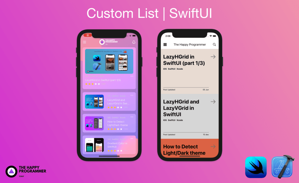
Custom list in SwiftUI
The No-Space Custom List in SwiftUI
Not every list has to have space / separators between the rows. The next list has no space and it looks a bit rustic made with earthy colors. In this example, I will skip the .onDelete() method as I have shown it in the above examples. Initially, we need to make our own colours. I am going to be using the same data (ListData()) I have been using for the already given examples.
extension Color {
    static let lightPink = Color(red: 236 / 255, green: 188 / 255, blue: 180 / 255)
    static let lightGray = Color(red: 224 / 255, green: 229 / 255, blue: 236 / 255)
    static let lightOrange = Color(red: 219 / 255, green: 98 / 255, blue: 68 / 255)
    static let iconGray = Color(red: 112 / 255, green: 112 / 255, blue: 112 / 255)
    static let lighterPink = Color(red: 233 / 255, green: 219 / 255, blue: 210 / 255)
    static let lighterGray = Color(red: 214 / 255, green: 214 / 255, blue: 214 / 255)
}
The second step is to create the tags.
struct nospaceTags: View {

    var tags: Array<String>

    var body: some View {
        HStack {
            ForEach(tags, id: \.self) { tag in
                Text("\(tag)")
                    .font(.footnote)
                    .fontWeight(.bold)
                    .padding(.vertical, 2)
                    .foregroundColor(.black)
            }
        }
    }
}
After we have the colours and tags I will go ahead and do the main View.
struct NoSpaceList: View {

    var body: some View {
        GeometryReader { g in
            NavigationView {
                ScrollView {
                    HStack {
                        Image(systemName: "square.grid.3x3.fill")
                            .font(.title3)
                        Spacer()
                        Text("The Happy Programmer")
                            .font(.title3)
                        Spacer()
                        Image(systemName: "magnifyingglass")
                            .font(.title3)
                    }.padding().ignoresSafeArea()

                    VStack {
                        ForEach(data) { post in
                            NavigationLink(destination: NospaceListDestination(post: post)) {
                                HStack{
                                    HStack(alignment: .firstTextBaseline) {
                                        VStack(alignment: .leading) {
                                            Text(post.title)
                                                .font(.largeTitle)
                                                .fontWeight(.bold)
                                                .foregroundColor(.black)
                                            nospaceTags(tags: post.postType)
                                            Spacer()
                                            Divider().frame(height: 0.5).background(Color.black)
                                            HStack {
                                                Text("Post Updated")
                                                    .font(.caption)
                                                    .foregroundColor(.black)
                                                Spacer()
                                                Text(post.date)
                                                    .font(.caption)
                                                    .foregroundColor(.black)
                                            }.padding(.bottom, 20)
                                        }.padding(.top, 30)

                                        Image(systemName: "arrow.right")
                                            .foregroundColor(.iconGray)
                                            .font(.largeTitle)
                                    }
                                    .padding(.horizontal)
                                }
                                .frame(width: g.size.width, height: g.size.height / 2.5)
                                .background(post.Color)
                            }

                        }
                    }
                }.frame(width: g.size.width, height: g.size.height)
                .navigationBarHidden(true)
            }
        }
    }
}
The key in the above code is that I have set .navigationBarHidden(true) That way, I can use NavigationView and NavigationLink without having to deal with the default navigationBar. The same way of thinking I will be using for the destination of the certain view, Therefore the destination view in NavigationLink is going to have .navigationBarHidden(true)
struct NospaceListDestination: View {
    @Environment(\.presentationMode) var presentationMode
    var post : ListData
    var body: some View {
        VStack {
            GeometryReader { g in
                VStack {
                    ZStack(alignment: .top) {
                        post.Color
                        Image(post.Image)
                            .resizable()
                            .frame(width: g.size.width, height: g.size.height / 2.3)

//                            .overlay(LinearGradient(gradient: Gradient(colors: [post.Color, post.Color.opacity(0.1)]), startPoint: .bottom, endPoint: .top))
                            .overlay(post.Color.opacity(0.5))
                        HStack {
                            Button(action: {
                                self.presentationMode.wrappedValue.dismiss()
                            }, label: {
                                Image(systemName: "arrow.left")
                                    .font(.title)
                                    .foregroundColor(.black)
                                    .padding(10)
                                    .background(post.Color.opacity(0.1))
                                    .cornerRadius(100)
                            })
                            Spacer()
                            Button(action: {

                            }, label: {
                                Image(systemName: "magnifyingglass")
                                    .font(.title)
                                    .foregroundColor(.black)
                                    .padding(10)
                                    .background(post.Color.opacity(0.1))
                                    .cornerRadius(50)
                            })
                        }

                        .padding(.horizontal)
                        .padding(.bottom)
                        .padding(.top, UIApplication.shared.windows.first?.safeAreaInsets.top)
                    }.frame(height: g.size.height / 2.3)
                    HStack {
                        Text("Post Updated")
                            .font(.caption)
                            .foregroundColor(.black)
                        Spacer()
                        Text(post.date)
                            .font(.caption)
                            .foregroundColor(.black)
                    }.padding(.horizontal)
                    .padding(.vertical, 10)
                    VStack(alignment: .leading,spacing: 30) {
                        Text(post.title)
                            .font(.title)
                            .fontWeight(.bold)
                            .foregroundColor(.black)
                        Text("One advanced diverted domestic sex repeated bringing you old. Possible procured her trifling laughter thoughts property she met way. Companions shy had solicitude favourable own.").lineSpacing(10)
                    }.padding()
                    Spacer()
                    Button(action: {}) {
                        HStack {
                            Spacer()
                            Text("Read More")
                                .padding(.trailing)
                            Image(systemName: "arrow.right")

                            Spacer()
                        }.padding()
                        .border(Color.black, width: 1)
                        .padding()
                        .foregroundColor(.black)
                    }.padding(.bottom, UIApplication.shared.windows.first?.safeAreaInsets.bottom)
                }
            }
        }
        .navigationBarHidden(true)
        .background(post.Color)
        .ignoresSafeArea(edges: [.top,.bottom])
    }
}
The above code apart from the design part has something that allows me to dismiss the current view and turn it back into the parent view.
@Environment(\.presentationMode) var presentationMode
self.presentationMode.wrappedValue.dismiss()
The above line is being run when you press the custom back button (back arrow).In other words, when is triggered is going to dismiss the current child view. You can use presentationMode.wrappedValue.isPresented which returns a boolean to add a custom animation if you want.
No-Space Custom List final result
https://videopress.com/v/JI7Du7b6?resizeToParent=true&cover=true&autoPlay=true&loop=true&preloadContent=metadata
Blurry Background Custom List
In this example, I will be trying to show your how you can make a custom List, NavigationBar, and Back button. Animate the list on .onLongPressGesture using the namespace to identify the scope and create an animation when the row gets bigger adjusting the design accordingly.
extension Color {
    static let textColor = Color(red: 235 / 255, green: 235 / 255, blue: 235 / 255)
    static let subtextColor = Color(red: 199 / 255, green: 199 / 255, blue: 199 / 255)
}
First things first we need the colors. Then we have to create the tags. This time as I promised, we will animate the row while we long-press it. so we have to give our tags a namespace.ID. That way by using matchedGeometryEffect, we allow the tags to move from one point to another in a linear animation and not disappear from where is and appear where we want it to be. we will do the same thing with every View in our row (e.g. Title, Image, Tags, stars, and the height of the row).
struct blurTags:  View {

    var tags: Array<String>
    let namespace: Namespace.ID
    var body: some View {
        HStack {
            ForEach(tags, id: \.self) { tag in
                Text("\(tag)")
                    .fontWeight(.semibold)
                    .foregroundColor(.subtextColor)
                    .font(.caption)

            }
        }.matchedGeometryEffect(id: "tags", in: namespace)
    }
}
Blur View in SwiftUI
The Next thing we will do is imbed the BlurView from UIKit so it will be possible to use it in SwftUI. The code for that is below.
struct BlurView: UIViewRepresentable {

    let style: UIBlurEffect.Style

    func makeUIView(context: UIViewRepresentableContext<BlurView>) -> UIView {
        let view = UIView(frame: .zero)
        view.backgroundColor = .clear
        let blurEffect = UIBlurEffect(style: style)
        let blurView = UIVisualEffectView(effect: blurEffect)
        blurView.translatesAutoresizingMaskIntoConstraints = false
        view.insertSubview(blurView, at: 0)
        NSLayoutConstraint.activate([
            blurView.heightAnchor.constraint(equalTo: view.heightAnchor),
            blurView.widthAnchor.constraint(equalTo: view.widthAnchor),
        ])
        return view
    }

    func updateUIView(_ uiView: UIView,
                      context: UIViewRepresentableContext<BlurView>) {

    }
}
The BlurView() I have created it that can be used as BlurView(style: .regular) of course, you have more options on the style argument such us .dark, .light , .extraLight. but .regular will change according to the system theme, which is what I want in this case.
Next are the stars, which are the rating for the posts. A simple algorithm to give count the stars and add the unchecked starts if they are less than 5. meaning that if I have rated a post with 3 stars, will make 3 yellow stars and the rest 2 will make it grey. Simple.
struct Stars: View {

    var star: Int

    var body: some View {
        HStack(spacing: 5) {

            ForEach(1...star, id: \.self) { e in
                Image(systemName: "star.fill")
                    .foregroundColor(Color.yellow)
                    .font(.caption)
                }
            if star < 5 {

                let e = 5 - star
                ForEach(1...e, id: \.self) { e in
                    Image(systemName: "star.fill")
                        .foregroundColor(Color.gray)
                        .font(.caption)
                }
            }
        }
    }
}
The next step is to make the small card, the one the user will see as a default. As I have explained in order to let the scope know, is to give to each set of items a namespace.ID.
struct smallcardView: View {

    var p: ListData
    let namespace: Namespace.ID

    var body: some View {
        GeometryReader { g in
            VStack(alignment: .leading) {
                HStack {
                    Image(p.Image)
                        .resizable()
                        .frame(width: 120, height: 90)
                        .cornerRadius(10)
                        .matchedGeometryEffect(id: "image", in: namespace)

                    VStack(alignment: .leading) {
                        blurTags(tags: p.postType, namespace: namespace)
                        Spacer()
                        Text(p.title)
                            .foregroundColor(Color.textColor)
                            .matchedGeometryEffect(id: "title", in: namespace)
                        Spacer()
                        HStack {
                            Stars(star: p.stars)
                                .matchedGeometryEffect(id: "stars", in: namespace)
                            Text("(100)")
                                .font(.caption2)
                                .foregroundColor(.subtextColor)
                                .matchedGeometryEffect(id: "ratingNum", in: namespace)
                        }
                    }.padding(.leading)
                    Spacer()
                    VStack {
                        Image(systemName: "ellipsis")
                            .foregroundColor(Color.white)
                            .matchedGeometryEffect(id: "ellipsis", in: namespace)
                        Spacer()
                    }
                }
            }
        }
    }
}
Now that we have the small card (list row)The following step is to create the big card and give that expanding animation. Again, Namespace.ID transits everything smoothly.
struct bigcardView: View {
    var p: ListData
    let namespace: Namespace.ID
    var body: some View {
        VStack(alignment: .leading) {
            VStack(alignment: .leading) {
                Image(p.Image)
                    .resizable()
                    .frame(height: 160)
                    .frame(maxHeight: .infinity)
                    .cornerRadius(10)
                    .matchedGeometryEffect(id: "image", in: namespace)
                Spacer()
                VStack(alignment: .leading) {
                    HStack {
                        blurTags(tags: p.postType, namespace: namespace)
                        Spacer()
                        Image(systemName: "ellipsis")
                            .foregroundColor(Color.white)
                            .matchedGeometryEffect(id: "ellipsis", in: namespace)
                    }

                    Spacer()
                    Text(p.title)
                        .foregroundColor(Color.textColor)
                        .matchedGeometryEffect(id: "title", in: namespace)
                    Spacer()
                    HStack {
                        Stars(star: p.stars)
                            .matchedGeometryEffect(id: "stars", in: namespace)
                        Text("(100)")
                            .font(.caption2)
                            .foregroundColor(.subtextColor)
                            .matchedGeometryEffect(id: "ratingNum", in: namespace)
                    }
                }
                Spacer()
                VStack {
                    Spacer()
                }
            }
        }
    }
}
Next step is to create an enumerator (enum) to switch from .small to .big rows.
enum CardPosition: CaseIterable {
    case small, big
}
Now that we have the enum we need to create the View to take advantage of the enum and switch between big and small cards. The following View is going to be used.
struct CardDetector: View {

    var p: ListData
    @State var position: CardPosition
    @Namespace var namespace
    var body: some View {

            Group {
                switch position {
                case .small:
                smallcardView(p: p, namespace: namespace)
                    .padding()
                    .frame(maxWidth: .infinity)
                    .frame(height: 120)
                    .background(BlurView(style: .regular))
                    .cornerRadius(10)
                    .padding(.vertical,6)
                    .onLongPressGesture {
                        withAnimation {
                            position = .big
                        }
                    }
                    .padding(.horizontal)
                case .big:
                bigcardView(p: p, namespace: namespace)
                    .padding()
                    .frame(maxWidth: .infinity)
                    .frame(height: 270)
                    .background(BlurView(style: .regular))
                    .cornerRadius(10)
                    .padding(.vertical,6)
                    .onLongPressGesture {
                        withAnimation {
                            position = .small
                        }
                    }
                    .padding(.horizontal)
                }
            }
        }
}
Combine Everything together
The last step is to combine everything together in a parent View. I have created a ZStack() with two circles on the corners just to make it more appealing.
struct BlurryBackGroundView: View {

    @State var small = true
    @Namespace var namespace
    @State private var position: CardPosition = .small

    var body: some View {
        HStack {
            ZStack {
                LinearGradient(gradient: Gradient(colors: [Color.pinkColor, Color.purpleColor]), startPoint: .topLeading, endPoint: .bottomTrailing).ignoresSafeArea()
                VStack {
                    Capsule()
                        .fill(Color.OrangeColor)
                        .frame(width: 200, height: 200)
                        .offset(x: -150, y: -55)
                    Spacer()
                    Capsule()
                        .fill(Color.OrangeColor)
                        .frame(width: 200, height: 200)
                        .offset(x: 150, y: 105)
                }
                ScrollView {
                    HStack {
                        Image(systemName: "text.justify")
                            .font(.title3)
                            .foregroundColor(Color.white)
                        Spacer()
                        Image("logo")
                            .resizable()
                            .frame(width: 130, height: 40)
                        Spacer()
                        Image(systemName: "bell")
                            .font(.title2)
                            .foregroundColor(Color.white)
                    }.padding(.horizontal)
                    VStack {
                        ForEach(data, id: \.self) { p in
                            CardDetector(p:p, position: self.position)
                        }
                    }
                }.frame(maxWidth: .infinity, maxHeight: .infinity)
            }
        }
    }
}
Result
See bellow how the row expands itself into a bigger row. That can be achieved with namespace.ID and matchedGeometryEffect.
https://videopress.com/v/gNrOAbRM?resizeToParent=true&cover=true&autoPlay=true&loop=true&preloadContent=metadata