

In this post I am going to cover everything you need to know to make your own custom buttons in SwiftUI. In this post I will cover a range of custom design buttons such as, Gradient and Neumorphic and many more. We will going to be applying effects while they are clicked. All in a clean and reusable way.
Default buttonStyle()
buttonStyle() is a modifier which set a custom style of a button. SwiftUI 2.0 comes with predefined options. such as PlainButtonStyle(), BorderlessButtonStyle(), DefaultButtonStyle().
struct ContentView: View {
    var body: some View {
        VStack(spacing: 10) {
            Button("Plain", action: {
            }).buttonStyle(PlainButtonStyle())
            Button("Borderless", action: {
            }).buttonStyle(BorderlessButtonStyle())
            Button("Default", action: {
            }).buttonStyle(DefaultButtonStyle())
        }
    }
}
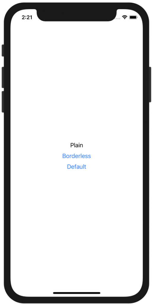
Default SwiftUI button styles
Plain Button
I shall start with a the default button to give an example. By clicking the only effect we see if a slight fadeout when is being pressed. I have created a simple toggle button using @State and I will be using it for a show case to demonstrate the customs buttons I have created.
struct ContentView: View {
    @State var favourite = false
    var body: some View {
        ZStack {
            Color.white
            Button(action: {
                self.favourite.toggle()
            }) {
                HStack {
                    Image(systemName: favourite ? "star.fill" : "star")
                        .foregroundColor(favourite ? Color.yellow : Color.gray )
                    Text("Favourite")
                }
            }
            .padding()
        }.ignoresSafeArea()
    }
}
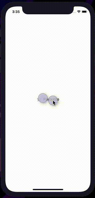
No buttonStyle() is being applied
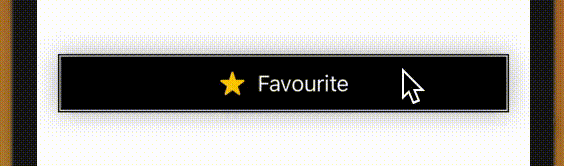
Gradient Button Style
For the next button I will have to extend a protocol named ButtonStyle. SwiftUI allows us to create custom buttons through a modifier, that way the style is reusable. The next button I am going to show you, is the gradient style button, using LinearGradient. First we will have to create the extension. where we can apply anything we the button to have like Shadow, cornerRadius, color.
struct GradientBackgroundStyle: ButtonStyle {

    var startColor: Color
    var endColor: Color

    func makeBody(configuration: Self.Configuration) -> some View {
        configuration.label
            .frame(maxWidth: .infinity)
            .padding()
            .foregroundColor(.white)
            .background(LinearGradient(gradient: Gradient(colors: [startColor, endColor]), startPoint: .leading, endPoint: .trailing).opacity(configuration.isPressed ? 0.5 : 1))
            .cornerRadius(40)
            .padding(.horizontal, 20)
            .shadow(radius: 10)
    }
}
Self.Configuration the instance of the button, on which we can see amongst many when the button is being pressed. It takes two arguments, which are the colors of the gradient, you can play more with it if you want. Now that out extension is ready I will go ahead and apply It to my default button, which in fact the only line of code I will add is to pass the GradientBackgroundStyle in the buttonStyle() modifier.
struct ContentView: View {
    @State var favourite = false
    var body: some View {
        ZStack {
            Color.white
            Button(action: {
                self.favourite.toggle()
            }) {
                HStack {
                    Image(systemName: favourite ? "star.fill" : "star")
                        .foregroundColor(favourite ? Color.yellow : Color.gray)
                    Text("Favourite")
                        .foregroundColor(Color.black)
                }
            }
            .buttonStyle(GradientBackgroundStyle(startColor: Color.pink, endColor: Color.purple))
            .padding()
        }.ignoresSafeArea()
    }
}
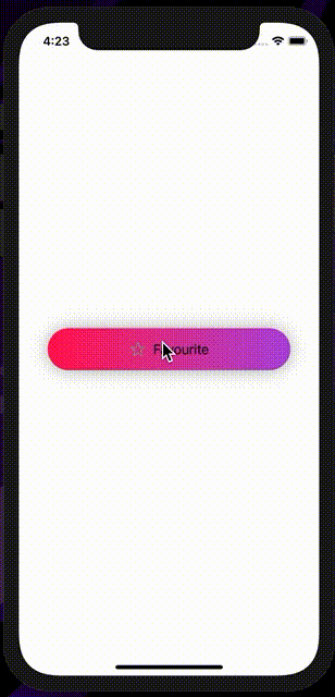
Gradient custom button
Outlined Rounded Corners
Create the button style to respond to a design of the equivalent button we want to make, which this time is an outlined button with corners corners.
struct RoundedCorners: ButtonStyle {

    var color: Color

    func makeBody(configuration: Self.Configuration) -> some View {
        configuration.label
            .frame(maxWidth: .infinity)
            .background(Color.white)
            .padding(10)
            .overlay(
                   RoundedRectangle(cornerRadius: 10)
                       .stroke(color, lineWidth: 1)
               )
        }
}
Let's apply this style to the View we created.
.buttonStyle(RoundedCorners(color: Color.black))
The View will look like this
struct ContentView: View {
    @State var favourite = false
    var body: some View {
        ZStack {
            Color.white
            Button(action: {
                self.favourite.toggle()
            }) {
                HStack {
                    Image(systemName: favourite ? "star.fill" : "star")
                        .foregroundColor(favourite ? Color.yellow : Color.gray)
                    Text("Favourite")
                        .foregroundColor(Color.black)
                }
            }
            .buttonStyle(RoundedCorners(color: Color.black))
            .padding()
        }.ignoresSafeArea()
    }
}
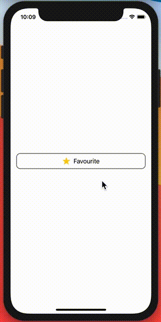
rounded corners outlined custom button
Outlined border
The next button has a scaleEffect which is being activated when is being pressed. The ButtonStyle protocol allow us to identify when the button is being pressed by passing the button's instance.
.scaleEffect(configuration.isPressed ? 0.9 : 1.0)
scale effect takes a Float, in this example is going to scale out our button and make is smaller when is being clicked.
struct OutlineBorder: ButtonStyle {

    var color: Color

    func makeBody(configuration: Self.Configuration) -> some View {
        configuration.label
            .frame(maxWidth: .infinity)
            .padding(.horizontal, 20)
            .padding(10)
            .background(configuration.isPressed ? color.opacity(0.5) : color)
            .foregroundColor(.white)
            .padding(2)
            .border(color, width: 1)
            .shadow(radius: 10)
            .scaleEffect(configuration.isPressed ? 0.99 : 1.0)
    }
}
Now add the style in our button.
.buttonStyle(OutlineBorder(color: Color.black))
I will look something like this
struct ContentView: View {
    @State var favourite = false
    var body: some View {
        ZStack {
            Color.white
            Button(action: {
                self.favourite.toggle()
            }) {
                HStack {
                    Image(systemName: favourite ? "star.fill" : "star")
                        .foregroundColor(favourite ? Color.yellow : Color.gray)
                    Text("Favourite")
                }
            }
            .buttonStyle(OutlineBorder(color: Color.black))
            .padding()
        }.ignoresSafeArea()
    }
}
Outlined border
Outline square button
The next button is a simple square button which I see very often lately on applications on App Store. is a simple outlined square button, which I am going to create give it a slight scale effect this time.
struct OutlineButton: ButtonStyle {

    var color: Color
    func makeBody(configuration: Self.Configuration) -> some View {
        configuration.label
            .frame(maxWidth: .infinity)
            .padding(.horizontal, 20)
            .padding(10)
            .border(color, width: 1)
            .foregroundColor(.white)
            .padding(2)
            .shadow(radius: 10)
            .scaleEffect(configuration.isPressed ? 0.99 : 1.0)

    }
}
Let's add the style in the default button we created.
struct ContentView: View {
    @State var favourite = false
    var body: some View {
        ZStack {
            Color.white
            Button(action: {
                self.favourite.toggle()
            }) {
                HStack {
                    Image(systemName: favourite ? "star.fill" : "star")
                        .foregroundColor(favourite ? Color.yellow : Color.gray)
                    Text("Favourite")
                        .foregroundColor(Color.black)
                }
            }
            .buttonStyle(OutlineButton(color: Color.black))
            .padding()
        }.ignoresSafeArea()
    }
}
It will look like this.
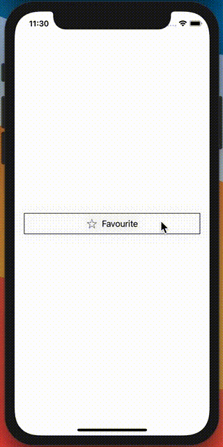
Outline square button
Neumorphic style Button
This is more demanding design, as I have to create my own colors to support a neumorphic design. First step is to create the background color and the two shadow colors, as I will have to create two layers of shadows to give that neumorphic look.
extension Color {
    static let lightShadow = Color(red: 255 / 255, green: 255 / 255, blue: 255 / 255)
    static let darkShadow = Color(red: 163 / 255, green: 177 / 255, blue: 198 / 255)
    static let background = Color(red: 224 / 255, green: 229 / 255, blue: 236 / 255)
}
struct neumorphic: ButtonStyle {
    var color: Color

    func makeBody(configuration: Self.Configuration) -> some View {
        configuration.label
            .padding(.horizontal,20)
            .padding(10)
            .background(Color.background)
            .cornerRadius(5)
            .shadow(color: Color.darkShadow, radius: 3, x: 2, y: 2)
            .shadow(color: Color.lightShadow, radius: 3, x: -2, y: -2)
            .scaleEffect(configuration.isPressed ? 0.9 : 1.0)
    }
}
Now let's apply everything to the default button. This will work like a charm!!
struct ContentView: View {
    @State var favourite = false
    var body: some View {
        ZStack {
            Color.background
            Button(action: {
                self.favourite.toggle()
            }) {
                HStack {
                    Image(systemName: favourite ? "star.fill" : "star")
                        .foregroundColor(favourite ? Color.yellow : Color.gray)
                    Text("Favourite")
                        .foregroundColor(Color.black)
                }
            }
            .buttonStyle(neumorphic(color: Color.background))
            .padding()
        }.ignoresSafeArea()
    }
}
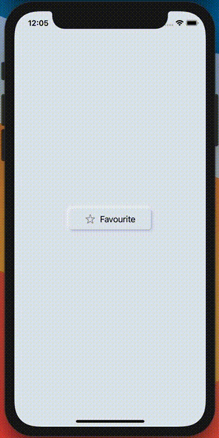
Neumorphic button
You can Find the code on my GitHub.